
Guide to Applications
How to Attach Elements to Tree Structures
Creating a console application implies creating a tree-like structure of elements.
The elements often are retrieved as data items from a specific data type. And you can group, sort and filter them.
You can also create your own elements not based on data types. You can use these simple custom elements as, for example, parents for data type based items or data folders.
Besides you can nest elements within elements thus creating quite a hierarchy of them.
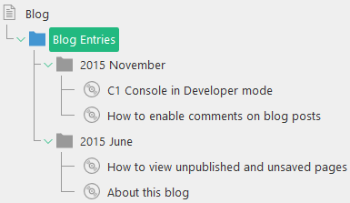
Figure 12: A hierarchy of elements in an application
The tree structure always starts with the tree’s root element – ElementRoot. This element is required and can contain the Children and Actions elements. (You will learn more about Actions in How to Attach Actions to Tree Elements.)
<ElementRoot>
  <Children>
    <!-- child elements if needed -->
  </Children>
  <Actions>
    <!-- action elements if needed -->
  </Actions>
</ElementRoot>
Listing 7: Children and Actions are child elements of ElementRoot
Please note that ElementRoot is only the root of the application tree structure and is different from the application root - ElementStructure. The ElementStructure element contains the ElementRoot element.
Please also note that you should always use the Children element when you nest elements in other elements.
<!-- parent element: start tag -->
  <Children>
    <!-- child element -->
  </Children>
<!-- parent element: end tag -->
Listing 8: Using Children when nesting elements
The child elements appear in the GUI as children of elements which the application is attached to.
You can use 3 kinds of elements when creating a tree structure:
In this chapter, you will learn to create and use simple elements and data elements. Data folder elements used to group data items are covered in How to Group Data Elements.
A simple element stands for a single item in a tree structure. Normally it is not data type based. This element may serve as a container (parent) for other elements such as data elements or data folder elements.
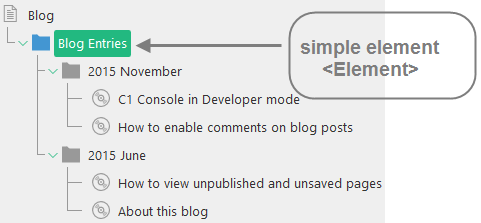
Figure 13: Simple elements
(A good practice is to have at least one simple element contained in ElementRoot.)
To add a simple element to a tree structure, you should use an Element element:
- Locate an element to serve as a parent.
- Add a Children element within this parent element.
- Add an Element element within the Children element.
- Specify its required attributes:
- Id: A unique string in the tree to identify the element
- Label: The label of the element
If necessary, specify its optional attributes:
- ToolTip: The tooltip of the element
- BrowserUrl: A custom URL for the element to show in the C1 Console browser when the element is focused
- Icon: The icon of the element when collapsed (closed)
- OpenedIcon: The icon of the element when expanded (opened)
<ElementRoot>
  <Children>
    <Element
      Id="TasksRoot"
      Label="Tasks"
      ToolTip="Tasks"
      BrowserUrl="http://c1.orckestra.com"
      Icon="pagetype-pagetype-rootfolder"
      OpenedIcon="pagetype-pagetype-rootfolder-open">
    </Element>
  </Children>
</ElementRoot>
Listing 9: Using Element
You can add as many Element elements as you need.
Please note that you cannot add an Element element within a DataFolderElements element.
Data elements stand for data items from a specific data type. Data items retrieved as data elements can be grouped, sorted and filtered.
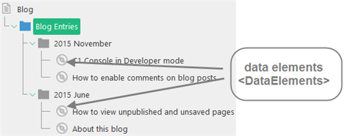
Figure 14: Data elements
It is a good practice to nest data elements within a container-like element such as a simple element (Element) or data folder elements (DataFolderElements).
To add data elements to a tree structure, you should use a DataElements element:
- Locate an element to serve as a parent.
- Add a Children element within this parent element.
- Add a DataElements element within the Children element.
- Specify its required attribute:
- Type: The data interface type name
If necessary, specify its optional attributes:
- Label: A custom label for each data item
- ToolTip: A custom tooltip for each data item
- ShowForeignItems: When set to “true”, data items not yet localized are displayed with a “Localize” action
- Display: A mode in which an element that might have child elements is displayed (Auto, Lazy, Compact)
- BrowserUrl: A custom URL for the element to show in the C1 Console browser when the element is focused
- Icon: The icon of the element when collapsed (closed)
- OpenedIcon: The icon of the element when expanded (open)
<DataElements  Type="Composite.Community.Blog.Entries"  Label="${C1:Data:Composite.Community.Blog.Entries:Title}"  Display="Auto">
</DataElements>
Listing 10: Using DataElements
How to Use Values from Data Type Fields
When you retrieve items from a data type, you are likely to need the values of the data type’s specific fields, different for each item (for example, for the Label attribute of DataElements).
Use the following model to get a value from a data type field:
${C1:Data:DataType:Field}
replacing “DataType” with the full name of the data type (including namespaces) and “Field” - with the name of the field.
For fields of type DateTime, decimal and int you can expand the model with formatting options, like this:
${C1:Data:DataType:Field:Format}
Format options are identical to those available for .NET .ToString() for the given type – for example “MMM d, yyyy” for DateTime fields and “C” for decimal and int.
For example,
${C1:Data:Composite.Community.Blog.Entries:Title}
${C1:Data:Composite.Community.Blog.Entries:Date:MMM d, yyyy}
In the same manner, you can pass a specific value to custom commands you can attach to tree elements (e.g. a CMS function).
If you want your application to match the language of the console GUI, consider use localized strings in its definition file.
While a hard-coded string read “Add Task”, the localized string will read “${TasksApp, AddTaskButtonLabel}”.
Here “TaskApp” stands for the name of a specific localization file without the culture/language code suffix and extension (e.g. “TaskApp.en-us.xml”) and “AddTaskButtonLabel” is the name of the string with the right text:
<string key="AddTaskButtonLabel" name="Add Task" />
In most cases, you will localize the GUI elements such as button labels and tree element labels, which is why you need to use this approach.
Please note that you have to register localization files used by your application in ~\App_Data\Composite\Composite.config to start using this approach.
Please refer Localizing Strings in Newsletter as a model for your localization.
How to Display Elements in Custom Perspectives
If you want your application to appear in a custom perspective, make sure you have followed these 3 major steps:
- Attach the application to the perspectives’ root.
- Use a simple element as the root of the tree of elements to provide the name for the perspective.
- Grant access to the new perspective to required users and/or user groups.
First of all:
- Add the ElementStructure.AutoAttachments element within the ElementStructure element.
- Add the NamedParent element within the ElementStructure.AutoAttachments element.
- Set its Name attribute to “PerspectivesRoot” and, if necessary, set its Position attribute.
<ElementStructure.AutoAttachments>
  <NamedParent Name="PerspectivesRoot" Position="Top" />
</ElementStructure.AutoAttachments>
Listing 11: Auto-attaching the application in its own perspective
(See “How to Auto-Attach Applications” for more information.)
Next:
- Add a Children element within the ElementRoot element, and then an Element element within this Children element.
- Specify its Id and Label attributes. Please note that the Label’s value will serve as the name of the new perspective.
<ElementRoot>
  <Children>
    <Element Id="TasksRoot" Label="Tasks">
    </Element>
  </Children>
</ElementRoot>
Listing 12: Using Element to provide a name for the new perspective
(See “Simple Elements” for more information.)
Finally:
- In the Users perspective, edit the user and/or user group you want to grant access to the new perspective.
- Check the new perspective in the list of perspectives. (For a user, see the Perspectives tab; for a user group, see the Perspectives group box.)
- Save the changes.
- Reload the Administrative console (F5).
(See “Security” for more information.)
The perspective should appear in the console.
How to Group Multiple Tree Definitions in One Perspective
In Composite C1 (now C1 CMS) version 3.2 or later, you can display multiple console applications, each defined in its own tree definition file, in the same perspective, new or existing (as a subfolder).
Let’s assume that you have five related tree definition files that you want to show in your own perspectives. Using one custom perspective for each tree definition would clutter the navigation pane in C1 CMS.
It makes sense to create a single custom perspective and display these tree definitions in it. One way is to merge all five tree definitions into one big tree definition file. However, it would be hard to maintain the markup in this way.
A better approach is to group all the five tree definitions in one perspective.
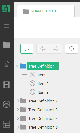
Figure 15: Several tree definitions grouped in one custom perspective
It can be a custom perspective or an existing one. In the latter case, the tree definitions will be grouped under one subfolder.
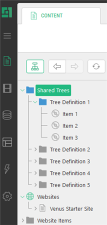
Figure 16: Several tree definitions grouped in one existing perspective
To group tree definitions in this manner, in each tree definition file:
- Add and set the ShareRootElementById attribute to “true” on the ElementRoot element.
- Set the Id attribute on the “root” Element element to the same value.
(Here the “root” Element element stands for the child of the ElementRoot element.)
Now C1 CMS will put in the same perspective all the trees that use the ShareRootElementById=”true” and the same Id in their “root” element.
<ElementStructure xmlns="http://www.composite.net/ns/management/trees/treemarkup/1.0" xmlns:f="http://www.composite.net/ns/function/1.0">
  <ElementStructure.AutoAttachments>
    <NamedParent Name="PerspectivesRoot" Position="Top" />
  </ElementStructure.AutoAttachments>
  <ElementRoot ShareRootElementById="true">
    <Children>
      <Element Label="Shared Trees" Id="SharedTreesId">
        <Children>
          <Element Label="Tree Definition 1" Id="Tree1Id">
            <Children>
               <!-- data elements etc -->
            </Children>
          </Element>
        </Children>
      </Element>
    </Children>
  </ElementRoot>
</ElementStructure>
Listing 13: A tree to appear in a custom perspective (“Shared Trees”)
Not only can you display trees in a new perspective but also in one of the existing perspectives, for example, “Content”.
<ElementStructure xmlns="http://www.composite.net/ns/management/trees/treemarkup/1.0" xmlns:f="http://www.composite.net/ns/function/1.0">
  <ElementStructure.AutoAttachments>
    <NamedParent Name="Content" Position="Top" />
  </ElementStructure.AutoAttachments>
  <ElementRoot ShareRootElementById="true">
    <Children>
      <Element Label="Shared Trees" Id="SharedTreesId">
        <Children>
          <Element Label="Tree Definition 1" Id="Tree1Id">
            <Children>
               <!-- data elements etc -->
            </Children>
          </Element>
        </Children>
      </Element>
    </Children>
  </ElementRoot>
</ElementStructure>
Listing 14: A tree to appear in an existing perspective (“Content”)
Use the standard procedures for adding elements to existing perspectives or custom perspectives when defining your trees.
Please note that it only works for trees that have a single “root” Element element (e.g. <Element Label="My Perspective" Id="ItemsRoot">). If you have multiple “root” Elements, the tree will not be grouped.
A good practice is two display tree elements under two nested Element elements. The first one provides a custom perspective with the label, tooltip and icons, or serves as the common subfolder in an existing perspective. The second one serves as a root for the tree elements from one tree definition.
  <ElementRoot ShareRootElementById="true">
    <Children>
      <Element Label="Shared Trees" Id="SharedTreesId">
        <Children>
          <Element Label="Tree Definition 1" Id="Tree1Id">
            <Children>
               <!-- data elements etc -->
            </Children>
          </Element>
        </Children>
      </Element>
    </Children>
  </ElementRoot>
Listing 15: Using nested Element elements in grouped tree definitions
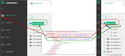
Figure 17: Nested Element elements in the CMS Console
Please note that the first loaded tree within the same group is the one that decides the label, tooltip and icon of the new perspective or the subfolder in the existing perspective. The elements of the root child of all trees in the same group are displayed under the new perspective/folder in load order.
Changing the perspective in the first loaded tree definition will change it for all other tree definitions in the same group even though they have other perspectives explicitly defined in the NamedParent element. Changing the perspective in any of the tree definitions not loaded first will have no such effect.
How to Display Custom URLs in the C1 Console for Elements
You can show some specific content in the C1 Console browser for an element when this element is selected (focused) in the tree.
To do so, use the BrowserUrl attribute on the elements that support this feature:
You can also use “${C1:Data:[TypeName]:[FieldName]}” in the URL to get a field value of a parent (or self) data element.
<ElementStructure xmlns="http://www.composite.net/ns/management/trees/treemarkup/1.0" xmlns:f="http://www.composite.net/ns/function/1.0">
  <ElementStructure.AutoAttachments>
    <NamedParent Name="Content" Position="Bottom" />
  </ElementStructure.AutoAttachments>
  <ElementRoot>
    <Children>
      <Element Label="Click me for the C1 website" Id="c1-website" Icon="cloud" BrowserUrl="http://c1.orckestra.com/" />
      <DataElements Type="Composite.Data.Types.IPageType" Icon="pagetype-pagetype" BrowserUrl="https://www.bing.com/search?q=${C1:Data:Composite.Data.Types.IPageType:Name}" />
    </Children>
  </ElementRoot>
</ElementStructure>
Listing 16: Using the BrowserUrl attribute on Element and DataElements elements