
Guide to Applications
How to Display Messages
C1 CMS normally displays two types of messages to the user:
- Message boxes that inform, ask, warn the user or report an error. They serve mostly informative purposes.
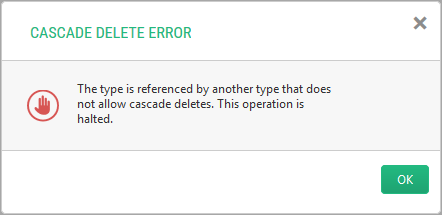
Figure 27: A message box
- Confirmation boxes that ask the user to confirm the action he or she are about to do (e.g. delete a page). If the user confirms it (by clicking “OK”) the action will be executed; otherwise, aborted.
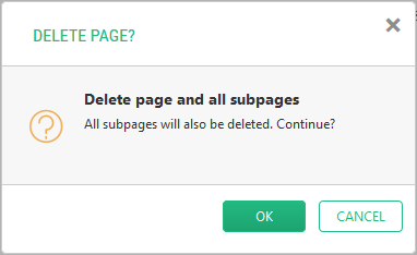
Figure 28: A confirmation box
To attach an action to a tree element to display a message box, you should use the MessageBoxAction element:
- Locate an element to attach the workflow to.
- Add an Actions element within the element if necessary.
- Add a MessageBoxAction element within the Actions elements.
- Set its required attribute:
- Label: The label of the action that shows the message box
- MessageBoxTitle: The title of the message box
- MessageBoxMessage: The message of the message box
If necessary, set its optional attributes:
- MessageDialogType: The type of the message box
- Icon: The icon of the action
- Tooltip: The custom tooltip of the action that shows the message box
- PermissionTypes: A list of permissions on the message box action
<Actions>  <MessageBoxAction    Label="GUID"    MessageBoxTitle="${C1:Data:Composite.Data.Types.IPage:Title}"    MessageBoxMessage="${C1:Data:Composite.Data.Types.IPage:Id}"/>
</Actions>
Listing 36: Attaching an action to display a message box
How to Display Confirmation Boxes
To attach an action to display a confirmation box, you should use a ConfirmAction element:
- Locate an element to attach the workflow to.
- Add an Actions element within the element if necessary.
- Add a ConfirmAction element within the Actions elements.
- Set its required attribute:
- Label: The label of the action
- ConfirmTitle: The title of the confirmation box
- ConfirnMessage: The message of the confirmation box
- Add a f:function element within the ConfirmAction element.
- Set its required attributes:
- name: The name of the CMS function
If the function requires so:
- Add one or more f:param elements within the f:function element.
- Set its required attribute:
- name: The name of the CMS function’s parameter
If necessary, set its optional attribute:
- value: The value of the CMS function’s parameter
If necessary, set the optional attributes of the ConfirmAction element:
- RefreshTree: When set to “true”, the tree refreshes if the user clicks “OK”
- Icon: The icon of the action
- ToolTip: The tooltip of the action
- PermissionTypes: A list of permissions on the custom URL action
- Location: The location of the action’s button on the toolbar
<Actions>
  <ConfirmAction Label="Delete Completed Tasks" Tooltip="Delete all the tasks marked completed">
    <f:function name="Demo.Tasks.DeleteCompleted"
      xmlns:f="http://www.composite.net/ns/function/1.0" />
  </ConfirmAction>
</Actions>
Listing 37: Attaching an action to display a confirmation box