
Components
Components are available in the visual editor and allow users to insert blocks of HTML and CMS Functions. You can add your own components.
Components can be static (inserting markup “as is”) or dynamic (invoking a CMS Function dialog and inserting the result of the function execution).
To create a new component, you add a markup file in ~/App_Data/Components or a directory below it.
The root element of the markup file define the type of component (static or dynamic).
- Files with
<html />as root element are static components. - Files with
<f:function />as root are dynamic components.
Static components
If you want to create a component that add a block of HTML or a CMS Function to a page, create a static component. These are identified by being xhtml documents.
Static component example:
<html pal:title="Hello World sample"
      pal:description="Inserts simple HTML and a CMS Function"
      pal:tags="sample"
      pal:icon="cake"
      xmlns="http://www.w3.org/1999/xhtml"
      xmlns:pal="http://www.composite.net/ns/components/1.0">
    <head>
    </head>
    <body>
        <h1>Hello World</h1>
        <p>This is a static component, containing HTML and a CMS Function.</p>
    	<f:function name="Composite.Utils.Date.Now"
                    xmlns:f="http://www.composite.net/ns/function/1.0" />
    </body>
</html>
For static components, the content within the body element is inserted into the Visual Editor. The pal:* attributes defined on the root node are used for presentation in the component palette.
You can add one or more <f:param /> elements inside <f:function /> elements – this will preset these parameters. At insert time, if your static component contains a function and one or more required parameters have not been preset, the user will be shown a dialog to set the parameters.
The ability to preset parameters give you the option to have multiple components containing the same function, but with different preset parameters.
Dynamic components
Dynamic components are based on a CMS Function – when selected, the user will get a “Function Properties” dialog where parameters can be set, and when the user is done, the CMS Function will execute and the result from the execution will be inserted into the Visual Editor.
Dynamic component example:
<f:function name="Composite.Constant.XhtmlDocument"
        pal:title="Echo sample"
        pal:description="Sample of a dynamic component. This will execute and simply echo html input."
        pal:tags="sample"
        pal:icon="cake"
        xmlns:f="http://www.composite.net/ns/function/1.0"
        xmlns:pal="http://www.composite.net/ns/components/1.0" />
The CMS Function execution output can contain HTML and markup for any number of CMS Functions.
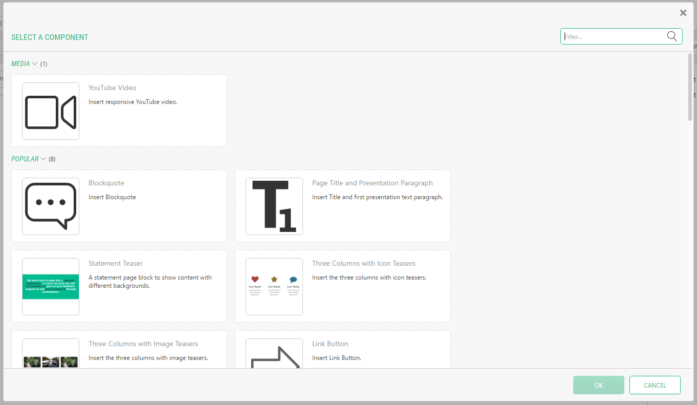
Palette view presentation
You control strings and the icon/image shown in the component palette by setting attributes on the root element. The following attributes are recognized:
pal:title– the title of the componentpal:description– the description of the componentpal:icon– name of icon to be used to represent the componentpal:image– relative or absolute URL for an image to be used (takes precedence over icon)pal:tags– one or more tags, separated by comma, defining which group the component should appear in.pal:container-classes– one or more container class names, separated by comma. Restrict the component to only be shown for Visual Editors having one of the specified container classespal:container-anti-classes– one or more container class names, separated by comma. Restrict the component to never be shown for Visual Editors having one of the specified container classes
All properties are optional. In the above, the pal namespace prefix refer to the XML namespace “http://www.composite.net/ns/components/1.0”.
Filtering Component availability
By default a Component will always be available, but you can limit what Components gets shown, like this:
- Attach container class names to editable HTML areas, see Container Classes.
- Edit the Component markup file and specify class names in the attribute
pal:container-classesto ensure your Component is only shown for editable HTML areas with this container class name. To do the opposite - hide components for a specific container class name, usepal:container-anti-classes.
Customizing headlines for tags
You create new component tags simply by writing them in into a components pal:tags attribute. In the component palette, this tag will be used as a heading.
You can customize tag headings by editing ~/App_Data/Composite/Configuration/ComponentTags.xml and set a title. You can use a string or a localized token (see localization below).
<Tags>
    <Tag name="sample" title="Component samples"/>
    <Tag name="media" title="Media"/>
</Tags>
Localizing labels in the palette view
Titles, descriptions and tag labels can be localized via .NET localization files by specifying a string with the following pattern:
${Resource, Resources.<resource_file_name>.<string_name>}
The strategy for localization is the same as is used for localizing other parts of the C1 Console – please see Localizing Forms for in-depth information.