
Customizing Datatypes
Editing Form Markup
When a user adds an item to a data type, C1 CMS automatically generates a XML-formatted form for entering values. By default, the input form in C1 CMS presents all the defined fields with matching widgets in an untitled field group box.
You can however customize the view of this form by editing its markup (XML). For example, you can make a text box read-only, add the title to a group box, group the widgets between two or more group boxes or tabs, or even use custom widgets for the fields defined in the data type.
In the following few sections you will learn how to edit a form’s markup and modify the form’s view.
You can change a data item form’s view and behavior by editing its markup (XML).
To edit the form markup:
- Select a data type.
- On the toolbar, click Edit Form Markup. The form markup opens in XHTML Source Editor in the working area.
- Edit the XML contents. (The form XML structure and editing basics will be discussed shortly.)
- Save the form markup.
The built-in XHTML validation mechanism will protect you from making mistakes while editing the form markup.
You will not be able to save poorly-formed XML. A message will inform you of an error if you try to save the form markup.
You can also force validation of the XML by clicking Format on the Source Editor’s toolbar. Again, a message will inform you of any error in the XML.
Normally, the message describes what is wrong in the content and specifies the line and the position where the poorly-formed XML starts. Hence, you can easily locate and correct the error.
When you save the modified form markup for the first time, a corresponding file is created on your hard disk as:
~/App_Data/Composite/DynamicTypeForms/<Namespace>/<DatatypeName>.xml
<Namespace> stands for the namespace of the data type
- <DatatypeName> stands for the name of the data type
For example, if you have a data type called Samples.Users, the file with modified markup can be found at:
~/App_Data/Composite/DynamicTypeForms/Samples/Users.xml
You can directly edit this file in an XML editor of your choice.
Important:Once the form markup file is generated, any changes to the data type will not be automatically synchronized to the form markup. You should update your form markup manually to match the changes. For example, if you have added a new field to the data type, it will not appear in the form markup, you should add this field manually as described in this chapter.
Overview of Form XML Structure
The auto-generated form markup has a default XML-based structure which only differs from form to form in fields and widgets. The elements used in the markup have their specific XML namespaces and defined in standard XML Schema definition files.
Some elements in the form markup are required, while others are optional.
Let’s first review the XML namespaces required for elements in the form markup and then have a look at the default form’s XML structure.
The form markup must specify a number of XML namespaces for XML elements to be valid and XML itself to be well-formed.
The following namespaces are present in the original form markup by default:
<cms:formdefinition xmlns:cms="http://www.composite.net/ns/management/bindingforms/1.0" xmlns="http://www.composite.net/ns/management/bindingforms/std.ui.controls.lib/1.0" xmlns:f="http://www.composite.net/ns/management/bindingforms/std.function.lib/1.0" >
<!-- skipped -->
</cms:formdefinition>
Listing 2: Required XML namespaces
Important: You should never remove these namespaces.
You can access and view the XML definitions by typing the following URL in your browser:
http://localhost/Composite/schemas
replacing localhost with the name of the server where your C1 CMS is running
If you use elements not covered by the above namespaces, you should specify additional namespace that will do. This might be the case with custom widgets.
Each form has the root element <cms:formdefinition> and two child elements: <cms:bindings> and <cms:layout>.
Bindings Section
Within the <cms:bindings> element, data type fields are listed, which are or can be bound to widgets.
Each field is introduced in the <cms:binding> element and has 3 attributes to set:
- name: (Required) It specifies the name of the field and corresponds to a data type field’s Name property in the GUI
- type: (Required) It specifies the type of the field and corresponds to the Field type property
- optional: (Optional) It indicates whether the binding is optional or required.
<cms:formdefinition xmlns:cms="http://www.composite.net/ns/management/bindingforms/1.0" xmlns="http://www.composite.net/ns/management/bindingforms/std.ui.controls.lib/1.0" xmlns:f="http://www.composite.net/ns/management/bindingforms/std.function.lib/1.0">
  <cms:bindings>
    <cms:binding name="Id" type="System.Guid" optional="true" />
    <cms:binding name="Name" type="System.String" optional="true" />
    <cms:binding name="Choice" type="System.Boolean" optional="true" />
  </cms:bindings>
  <!-- skipped -->
</cms:formdefinition>
Listing 3: Sample elements in <cms:bindings>
Important: The <cms:bindings> section is filled by C1 CMS automatically based on the data type used with this form. Youare not supposed to change anything here.
The fields listed here are referred to in the <cms:layout> section when used in or bound to widgets.
Layout Section
The layout of the form is handled in the <cms:layout> element. This is where you can add, modify or remove widget elements and change the layout of the widgets on the editor form in general.
The <cms:layout> element has two optional attributes, also mirrored in its respective child elements:
- label (<cms:label>): specifies the label of the form, which appears as a title on the tab in the working area. If no value is provided, the name of the data type is displayed instead.
- iconhandle (<cms:iconhandle>): specifies the icon to use with the form’s label. If no value is provided, the default icon is used.
In the form markup, the label is set to the data type field, which is configured to serve as a title field in lists.
Root Element in Layout Section
Within the <cms:layout> element, a root element must be defined, which will serve as a container for other elements representing widgets or other containers.
By default, C1 CMS places all the elements under the <FieldGroup> element that serves as a container and the root element here. However, you can use other container elements available for the form instead of <FieldGroup>.
Under the root element in the <cms:layout> section, C1 CMS places the widget elements binding them to the data type fields specified in the <cms:bindings> section.
Note: Along with widget elements you can insert other elements in this section such as container elements and functions. In this guide we will only focus on widgets and containers.
As a rule, a widget element has a number of attributes that in most cases match the widget’s properties you can set for a data type field in the GUI. However, some widgets may have attributes that can be set only in the form markup.
The attributes are normally mirrored in respective child elements, which are more preferable for use in a number of cases. For example, you can set the Help text for a widget by using the Help attribute of the widget element:
<TextBox Label="Name" Help="Enter your name here" />
Listing 4: Setting the Help property in the Help attribute
When you, however, bind the widget’s property to a data type field (“Text”, in the example below), you will most likely use its corresponding child element. In the example below, it is accounted for by using another element for the value:
<cms:formdefinition xmlns:cms="http://www.composite.net/ns/management/bindingforms/1.0" xmlns="http://www.composite.net/ns/management/bindingforms/std.ui.controls.lib/1.0" xmlns:f="http://www.composite.net/ns/management/bindingforms/std.function.lib/1.0">
  <!-- skipped -->
  <cms:layout>
  <!-- skipped -->
    <TextBox Label="Name" Help=" Enter your name here ">
      <TextBox.Text>
        <cms:bind source="Name" />
      </TextBox.Text>
    </TextBox>
    <!-- skipped -->
  </cms:layout>
</cms:formdefinition>
Listing 5: Setting the Text property in the Text child element
Most widget or container elements have at least two common attributes: Label and Help.
As the names suggest, these attributes specify the label and the help text for a widget or a container. They correspond to the Label and Help properties of a data type field specified in the GUI.
Each widget that has a bindable property can be initialized with a specific value.
3 options are available for simple values:
- Specifying a value in the corresponding element’s attribute
- Placing a value between a widget element’s start and end tags and thus referring to the bindable property implicitly
- Placing a value between the start and end tags of a widget’s bindable property element (explicitly)
For instance, you have a TextBox widget named and labeled “Country” to be initialized with “Denmark” as a value. The TextBox widget has a bindable property called Text available both as an attribute and as a child element. Your options could be:
<TextBox Label="Country" Text="Denmark" />
Listing 6: Initializing the value in an attribute (Option 1)
<TextBox Label="Country">Denmark</TextBox>
Listing 7: Initializing the value of the bindable property implicitly (Option 2)
<TextBox Label="Country">
  <TextBox.Text>Denmark</TextBox.Text>
</TextBox>
Listing 8: Initializing the value of the bindable property explicitly (Option 3)
You can also use a value that the corresponding data type field might have, especially if the field has a default value. In this case, you should use the <cms:read /> element and specify the field’s name in its source attribute. You can use the <cms:read /> element in the last 2 options (as a child element).
For example, your data type has a field named “Country” and you want to set the widget to whatever the value is in this field by default. You can do one of the following:
<cms:formdefinition xmlns:cms="http://www.composite.net/ns/management/bindingforms/1.0" xmlns="http://www.composite.net/ns/management/bindingforms/std.ui.controls.lib/1.0" xmlns:f="http://www.composite.net/ns/management/bindingforms/std.function.lib/1.0">
  <!-- skipped -->
  <cms:layout>
  <!-- skipped -->
    <TextBox Label="Country">
      <cms:read source="Country" />
    </TextBox>
    <!-- skipped -->
  </cms:layout>
</cms:formdefinition>
Listing 9: Initializing the value with <cms:read> implicitly (Option 2)
<cms:formdefinition xmlns:cms="http://www.composite.net/ns/management/bindingforms/1.0" xmlns="http://www.composite.net/ns/management/bindingforms/std.ui.controls.lib/1.0" xmlns:f="http://www.composite.net/ns/management/bindingforms/std.function.lib/1.0">
  <!-- skipped -->
  <cms:layout>
  <!-- skipped -->
    <TextBox Label="Country">
      <TextBox.Text>
        <cms:read source="Country" />
      </TextBox.Text>
    </TextBox>
    <!-- skipped -->
  </cms:layout>
</cms:formdefinition>
Listing 10: Initializing the value with <cms:read> explicitly (Option 3)
When C1 CMS auto-generates a form, it normally uses Option 3 - the <cms:read /> element to bind a data type field to a matching widget.
When you bind a data type field to a widget, not only is the value of the field copied to the widget but also the value entered by the user in the widget is copied to the data type field.
To bind a data type field to the widget property, you should use the <cms:bind /> element.
<cms:formdefinition xmlns:cms="http://www.composite.net/ns/management/bindingforms/1.0" xmlns="http://www.composite.net/ns/management/bindingforms/std.ui.controls.lib/1.0" xmlns:f="http://www.composite.net/ns/management/bindingforms/std.function.lib/1.0">
  <!-- skipped -->
  <cms:layout>
  <!-- skipped -->
    <TextBox.Text>
      <cms:bind source="Name" />
    </TextBox.Text>
    <!-- skipped -->
  </cms:layout>
</cms:formdefinition>
Listing 11: Binding a filed to a widget’s property
In the source attribute of this element, you specify the field you bind to the widget. One field can be only bound to one widget. The field bound to a widget must be listed in the <cms:bindings> section.
Each widget used with a data type field is represented with widget elements in the form markup.
To see definition of all the available elements:
- Type http://localhost/Composite/schemas in your browser replacing localhost with the name of the server where your C1 CMS is running.
- Click the namespace URL http://www.composite.net/ns/management/bindingforms/std.ui.controls.lib/1.0
The following is the list of widgets matched against their widget elements:
Widgets Matched Against Elements | ||
Field Widget | Field Type | Element in Form XML |
TextBox | String, Integer, Decimal, GUID | <TextBox /> |
TextArea | String | <TextArea /> |
DateSelector | Date | <DateSelector /> |
DateTimeSelector | Date | <DateTimeSelector /> |
CheckBox | Boolean | <CheckBox /> |
BoolSelector | Boolean | <BoolSelector /> |
VisualXhtmlEditor | String | <InlineXhtmlEditor /> |
DataIdMultiSelector | String | <MultiKeySelector /> |
Selector | String | <KeySelector /> |
Selector | String | <MultiKeySelector /> |
ImageSelector | Data Reference: C1 Image | <KeySelector /> |
MediaFileSelector | Data Reference: C1 Media File | <KeySelector /> |
MediaFolderFileSelector | Data Reference: C1 Media Folder | <DataReferenceSelector /> |
Selector | Data Reference (all types) | <KeySelector /> |
OptionalSelector | Data Reference (all types) | <KeySelector /> |
As you can see in the table above, many data type field widgets are implemented with fewer widget elements configured in the properties to be widget-specific.
For example, TextBox widgets for different field types are implemented with the same <TextBox> element and differ in the value of its implicit Type attribute. You will learn about using the TextBox’s Type attribute shortly.
Various selectors are implemented in most cases with the <KeySelector> element. In some specific cases, two additional selector elements are used: <MultiKeySelector> and <DataReferenceSelector>.
Specific Widget Element Attributes
Apart from the two properties, Label and Help, common to all the widgets and available as attributes and child elements of widget elements, the latter may have their specific attributes.
Normally, you can set them either in the Field Widget Configuration window or in the form markup. In some cases, you can only access their attributes in the form markup (for example, Type of <TextBox>).
The following is the list of the correspondences between the widget property and the widget element’s attribute or child attribute. If the attribute has no corresponding widget property, the attribute is element-specific and can be only set in the form markup. A bindable property can be normally configured as the field’s Default value property.
(The Label and Help attributes are omitted as common to all the elements below.)
<TextBox> | ||
Widget Element Attribute | Widget Property | Bindable |
Text | Yes | |
Type | ||
<TextArea> | ||
Widget Element Attribute | Widget Property | Bindable |
Text | Yes | |
Type | ||
<DateSelector> | ||
Widget Element Attribute | Widget Property | Bindable |
Date | Yes | |
<DateTimeSelector> | ||
Widget Element Attribute | Widget Property | Bindable |
Text | Yes | |
<CheckBox> | ||
Widget Element Attribute | Widget Property | Bindable |
Checked | Yes | |
ItemLabel | Sub label | |
<BoolSelector> | ||
Widget Element Attribute | Widget Property | Bindable |
IsTrue | Yes | |
TrueLabel | True label | |
FalseLabel | False label | |
<InlineXhtmlEditor> | ||
Widget Element Attribute | Widget Property | Bindable |
Xhtml | Yes | |
ClassConfigurationName | Class configuration name | |
EmbedableFieldsTypes | ||
<KeySelector> | ||
Widget Element Attribute | Widget Property | Bindable |
Selected | Yes | |
Options | Options | |
OptionsKeyField | Source key field name | |
OptionsLabelField | Source label field name | |
Required | Selection required | |
BindingType | ||
SelectedIndexChangedEventHandler | ||
<MultiKeySelector> | ||
Widget Element Attribute | Widget Property | Bindable |
Selected | Yes | |
Options | Options | |
OptionsKeyField | Source key field name | |
OptionsLabelField | Source label field name | |
Required | Selection required | |
CompactMode | Compact mode | |
BindingType | ||
SelectedIndexChangedEventHandler | ||
<DataReferenceSelector> | ||
Widget Element Attribute | Widget Property | Bindable |
Selected | Yes | |
DataType | ||
It depends on the type of selector widget whether <KeySelector> and <MultiKeySelector> have their properties available for configuration in the Field Widget Configuration window. The names of the properties might also differ in the GUI from selector to selector.
If you examine the XML schema definition for form UI controls (http://www.composite.net/ns/management/bindingforms/std.ui.controls.lib/1.0), you will notice that it has a number of other elements, for example, <Heading> or <MarkupEditor>.
Normally, they are not used in regular data type forms and are out of the scope in this guide.
The TextBox widget can be customized in both its view and its behavior by setting the Type attribute of the <TextBox> element in the form markup.
The following values are possible:
<TextBox> Type Attribute Values | |
Value | Description |
ReadOnly | Makes the text box read-only |
Password | Hides the input string behind a string of special characters as used on password fields |
String | Accepts strings only |
Integer | Accepts integers only |
Decimal | Accepts decimals only |
Guid | Accepts GUIDs only |
ProgrammingIdentifier | Accepts Programming Identifiers only; normally not used in data type forms |
ProgrammingNamespace | Accepts Programming Namespaces only; normally not used in data type forms |
Using these values, you can make the text box widget read-only, hide passwords behind a string of specific characters, or link it to a specific field type such as an integer or a GUID leading to validation of its input values.
For example, if you want the text box widget to be read-only:
- Edit the form markup.
- Add the Type attribute to the TextBox element.
- Specify “ReadOnly” as the value in the attribute.
- Save the form.
When you add a data item, you will see that the text box is now read-only.
Note: The TextArea widget also has the Type attribute, but it can only accept the “ReadOnly” value; other values are only TextBox-specific.
By default, C1 CMS places all the widgets in a field group box. In the form markup, the latter is represented with the <FieldGroup> element. This is a container element, and therefore can contain other elements.
In addition to the <FieldGroup> element, you can use two more container elements in the form markup: <PlaceHolder> and <TabPanels>.
The <FieldGroup> container element arranges its elements one below another and places them in a box. Its primary purpose is - as the name suggests – to group related field widgets, enhancing usability of the form, as a result.
It has two attributes: Label and Help. By default, it has no attributes specified in the auto-generated form markup. However, you can use its Label attribute to have a titled group box.
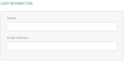
Figure 6: A field group with the label
The <PlaceHolder> container element is the simplest out of the three. As <FieldGroup>, it also arranges its elements one below another, but without placing them in a box. It practically has no visual representation.
It has two attributes: Label and Help. When used alone, the attribute values are not used. They might become visible when used in combination with other container elements.
<PlaceHolder> keeps the elements within its borders and can be used as a root element in the <cms:layout> section to arrange several field group boxes.
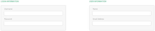
Figure 7: <PlaceHolder> used to lay out two field groups
You can also use it as a single tab in <TabPanels>.
The <TabPanels> container element groups widgets on tabs handling a form overloaded with numerous fields and enhancing its usability, as a result.
It uses its child elements as individual tabs so the best option to choose is a number of <PlaceHolder> elements as its child elements, each with the actual widgets or group of widgets within these “tab” place holders.
Figure 8: <TabPanels> used
Apart from its Label and Help attributes, usually not visible in the form GUI, it has its own specific attribute – PreSelectedIndex – which allows you to pre-select the tab when the form opens.
The index is zero-based, so if you have 3 tabs on your form, you should set this attribute to “2” if you want the 3rd tab to be pre-selected.
By default, C1 CMS generates a form that displays all its widgets in a group box. To enhance usability of the form, you can group related widgets using multiple field groups or you can place groups of field widgets on multiple tabs on a form.
Grouping Fields between Multiple Field Groups
To be able to use multiple field groups in the same form, you should change the root element in the <cms:layout> section of the form markup. The best option is <PlaceHolder>.
Also using two or more field groups implies naming each of the group for easier reference and better user experience.
- Edit the form markup.
- Insert the <PlaceHolder> element in <cms:layout>.
- Place the current <FieldGroup> element with all its child elements within <PlaceHolder>.
- Based on your requirements, add one or more <FieldGroup> elements within <PlaceHolder>
- Move the necessary widget elements from the original <FieldGroup> to those you have just added where appropriate.
- Add the Label attribute to each <FieldGroup> and use it to name each field group.
- Save your form.
<PlaceHolder>
   <FieldGroup Label="Required Settings">
      <!-- widget elements go here -->
   </FieldGroup>
   <FieldGroup Label="Optional Settings">
      <!-- widget elements go here -->
   </FieldGroup>
</PlaceHolder>
Listing 12: Multiple field groups
Once the form is saved, you can add an item to the data type it represents and see the changes in its view.
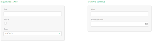
Figure 9: Multiple field groups in the GUI
Grouping Fields on Multiple Tabs
If you want to group the widgets using tabs, you should change the root element in the <cms:layout> section of the form markup to the <TabPanels>. Besides, you should create each tab individually by using <PlaceHolder> elements within <TabPanels>.
As tabs normally have titles, you should also name them. Optionally, you can pre-select a certain tab when the form opens.
- Edit the form markup.
- Insert the <TabPanels> element within <cms:layout>.
- Within <TabPanels>, insert as many <PlaceHolder> elements as many tabs you need.
- Add the Label attribute to each <PlaceHolder> and use it to name each tab.
- Place the current <FieldGroup> element with all its child elements within the first <PlaceHolder>.
- Insert a <FieldGroup> element into the empty <PlaceHolder>.
- Based on your requirements, move the necessary widget elements from the original <FieldGroup> in the first <PlaceHolder> to the <FieldGroup> within the empty <PlaceHolder>.
- If you have more than two tabs, repeat Steps 6-7.
- Optionally, you can add the PreSelectedIndex attribute to the <TabPanels> element and specify its value.
- Save your form.
<TabPanels>
<PlaceHolder Label="Main">
      <FieldGroup >
         <!-- widget elements go here -->
      </FieldGroup>
</PlaceHolder>
<PlaceHolder Label="Optional">
      <FieldGroup >
         <!-- widget elements go here -->
      </FieldGroup>
</PlaceHolder>
</TabPanels>
Listing 13: Multiple tabs
Once the form is saved, you can add an item to the data type it represents and see the changes.
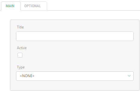
Figure 10: Multiple tabs in the GUI
You are not limited to one field group on one tab. You can create as many field groups as you need.
Besides, you can have child tabs on a tab. You just need to add another <TabPanels> element within one of the <PlaceHolder> elements and repeat the above procedure.
Example of Editing Form Markup
Let’s assume that you have data type that holds information about user account. Each user account must have the following fields:
Required personal information
- Username
- Password
- Name
- Email Address (Email)
Optional personal information
- Age
- City
- Country
Service information
- User ID (UserId)
- Account Created (Created)
The requirements to the form are as follows:
- The fields must be distributed between 3 tabs (as it is grouped in the list above): “Main”, “Optional”, and “Service”.
- The Username and Password fields must be grouped in the Login field group, the Name and Email Address fields must be grouped in the User Information field group.
- The password in the Password field should be hidden.
- The User ID must be read-only and show the GUID of the user account generated and assigned when the account was created.
- The Account Created field must be read-only and show the date when the account was created.
Before changing the form markup, you should specify the default value for the Created field:
- Select the Created field.
- On the Advanced tab, click in the Default value field.
- In the Select Function dialog, select the Composite.Utils.Date.Now function.
- Click OK in the Select Function dialog and then in the Field Default Value Configuration.
When the user opens the form to enter values in the fields, the Account Created field will be already initialized to the current date.
First, let’s see what markup C1 CMS generated by default:
<cms:formdefinition xmlns:cms="http://www.composite.net/ns/management/bindingforms/1.0" xmlns="http://www.composite.net/ns/management/bindingforms/std.ui.controls.lib/1.0" xmlns:f="http://www.composite.net/ns/management/bindingforms/std.function.lib/1.0">
<cms:bindings>
<cms:binding name="Id" type="System.Guid" optional="true" />
<cms:binding name="Username" type="System.String" optional="true" />
<cms:binding name="Password" type="System.String" optional="true" />
<cms:binding name="Name" type="System.String" optional="true" />
<cms:binding name="Email" type="System.String" optional="true" />
<cms:binding name="Age" type="System.Int32" optional="true" />
<cms:binding name="City" type="System.Guid" optional="true" />
<cms:binding name="Country" type="System.Guid" optional="true" />
<cms:binding name="Created" type="System.DateTime" optional="true" />
</cms:bindings>
<cms:layout>
<cms:layout.label>
<cms:read source="Name" />
</cms:layout.label>
<FieldGroup>
<TextBox Label="Username" Help="">
<TextBox.Text>
<cms:bind source="Username" />
</TextBox.Text>
</TextBox>
<TextBox Label="Password" Help="">
<TextBox.Text>
<cms:bind source="Password" />
</TextBox.Text>
</TextBox>
<TextBox Label="Name" Help="">
<TextBox.Text>
<cms:bind source="Name" />
</TextBox.Text>
</TextBox>
<TextBox Label="Email Address" Help="">
<TextBox.Text>
<cms:bind source="Email" />
</TextBox.Text>
</TextBox>
<TextBox Label="Age" Help="" Type="Integer">
<TextBox.Text>
<cms:bind source="Age" />
</TextBox.Text>
</TextBox>
<KeySelector Label="City" Help="" OptionsKeyField="Key" OptionsLabelField="Label" Required="false">
<KeySelector.Selected>
<cms:bind source="City" />
</KeySelector.Selected>
<KeySelector.Options>
<f:StaticMethodCall Type="<t n="Composite.StandardPlugins.Functions.WidgetFunctionProviders.StandardWidgetFunctionProvider.DataReference.NullableDataReferenceSelectorWidgetFunction`1, Composite, Version=1.2.3610.26719, Culture=neutral, PublicKeyToken=null">
<t n="DynamicType:Demo.Cities" />
</t>" Method="GetOptions" Parameters="DynamicType:Demo.Cities" />
</KeySelector.Options>
</KeySelector>
<KeySelector Label="Country" Help="" OptionsKeyField="Key" OptionsLabelField="Label" Required="false">
<KeySelector.Selected>
<cms:bind source="Country" />
</KeySelector.Selected>
<KeySelector.Options>
<f:StaticMethodCall Type="<t n="Composite.StandardPlugins.Functions.WidgetFunctionProviders.StandardWidgetFunctionProvider.DataReference.NullableDataReferenceSelectorWidgetFunction`1, Composite, Version=1.2.3610.26719, Culture=neutral, PublicKeyToken=null">
<t n="DynamicType:Demo.Countries" />
</t>" Method="GetOptions" Parameters="DynamicType:Demo.Countries" />
</KeySelector.Options>
</KeySelector>
<DateSelector Label="Account Created" Help="">
<DateSelector.Date>
<cms:bind source="Created" />
</DateSelector.Date>
</DateSelector>
</FieldGroup>
</cms:layout>
</cms:formdefinition>Listing 14: Form markup auto-generated by C1 CMS
All the fields are placed together within one field group.
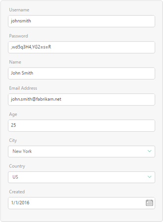
Figure 11: Data item editor form auto-generated by C1 CMS
Now let’s implement the requirements to the form.
<cms:formdefinition xmlns:cms="http://www.composite.net/ns/management/bindingforms/1.0" xmlns="http://www.composite.net/ns/management/bindingforms/std.ui.controls.lib/1.0" xmlns:f="http://www.composite.net/ns/management/bindingforms/std.function.lib/1.0">
<cms:bindings>
<cms:binding name="Id" type="System.Guid" optional="true" />
<cms:binding name="Username" type="System.String" optional="true" />
<cms:binding name="Password" type="System.String" optional="true" />
<cms:binding name="Name" type="System.String" optional="true" />
<cms:binding name="Email" type="System.String" optional="true" />
<cms:binding name="Age" type="System.Int32" optional="true" />
<cms:binding name="City" type="System.Guid" optional="true" />
<cms:binding name="Country" type="System.Guid" optional="true" />
<cms:binding name="Created" type="System.DateTime" optional="true" />
</cms:bindings>
<cms:layout>
<cms:layout.label>
<cms:read source="Name" />
</cms:layout.label>
<TabPanels>
<PlaceHolder Label="Main">
<FieldGroup Label="Login">
<TextBox Label="Username" Help="">
<TextBox.Text>
<cms:bind source="Username" />
</TextBox.Text>
</TextBox>
<TextBox Label="Password" Help="" Type="Password">
<TextBox.Text>
<cms:bind source="Password" />
</TextBox.Text>
</TextBox>
</FieldGroup>
<FieldGroup Label="User Information">
<TextBox Label="Name" Help="">
<TextBox.Text>
<cms:bind source="Name" />
</TextBox.Text>
</TextBox>
<TextBox Label="Email Address" Help="">
<TextBox.Text>
<cms:bind source="Email" />
</TextBox.Text>
</TextBox>
</FieldGroup>
</PlaceHolder>
<PlaceHolder Label="Optional">
<FieldGroup>
<TextBox Label="Age" Help="" Type="Integer">
<TextBox.Text>
<cms:bind source="Age" />
</TextBox.Text>
</TextBox>
<KeySelector Label="City" Help="" OptionsKeyField="Key" OptionsLabelField="Label" Required="false">
<KeySelector.Selected>
<cms:bind source="City" />
</KeySelector.Selected>
<KeySelector.Options>
<f:StaticMethodCall Type="<t n="Composite.StandardPlugins.Functions.WidgetFunctionProviders.StandardWidgetFunctionProvider.DataReference.NullableDataReferenceSelectorWidgetFunction`1, Composite, Version=1.2.3610.26719, Culture=neutral, PublicKeyToken=null">
<t n="DynamicType:Demo.Cities" />
</t>" Method="GetOptions" Parameters="DynamicType:Demo.Cities" />
</KeySelector.Options>
</KeySelector>
<KeySelector Label="Country" Help="" OptionsKeyField="Key" OptionsLabelField="Label" Required="false">
<KeySelector.Selected>
<cms:bind source="Country" />
</KeySelector.Selected>
<KeySelector.Options>
<f:StaticMethodCall Type="<t n="Composite.StandardPlugins.Functions.WidgetFunctionProviders.StandardWidgetFunctionProvider.DataReference.NullableDataReferenceSelectorWidgetFunction`1, Composite, Version=1.2.3610.26719, Culture=neutral, PublicKeyToken=null">
<t n="DynamicType:Demo.Countries" />
</t>" Method="GetOptions" Parameters="DynamicType:Demo.Countries" />
</KeySelector.Options>
</KeySelector>
</FieldGroup>
</PlaceHolder>
<PlaceHolder Label="Service">
<FieldGroup>
<TextBox Label="User ID" Help="" Type="ReadOnly">
<TextBox.Text>
<cms:read source="Id" />
</TextBox.Text>
</TextBox>
<TextBox Label="Account Created" Help="" Type="ReadOnly">
<TextBox.Text>
<cms:read source="Created" />
</TextBox.Text>
</TextBox>
</FieldGroup>
</PlaceHolder>
</TabPanels>
</cms:layout>
</cms:formdefinition>Listing 15: Customized form markup
Let’s highlight some of the changes in the markup above. First of all, we have created tabs and field groups and distributed the existing widgets among them:
- We have added a <TabPanels> element in the <cms:layout> and inserted 3 child <PlaceHolder> elements within the <TabPanels> element. We have also added the Label attribute to each <PlaceHolder> element and set its value to “Main”, “Optional” and “Service”.
- We have moved the default <FieldGroup> element with all its child elements to the Main tab. We have also added the Label attribute to this <FieldGroup> element and set its value to “Login”.
- We have added another <FieldGroup> element onto the Main tab, set its Label attribute to “User Information” and moved 3 widget elements in for these fields: FirstName, LastName, Email.
- We have added another <FieldGroup> element onto the Optional tab and moved 3 widget elements in for these fields: Age, City, and Country.
- We have added another <FieldGroup> element onto the Service tab and moved 1 widget element in for this field: Created.
Next, we have modified the widget elements so that they meet the requirements:
- We have added the Type attribute to the Password widget element and set its value to “Password”.
- We have replaced the <DateSelector> widget element for the Created field with a <TextBox>. We do not want users to select the date in this widget, and we want this field to be read-only. That is why we have chosen the <TextBox> for displaying the value. We have also added the Type attribute to this element and set it to “ReadOnly”.
- We have added another <TextBox> element above the Created field, set its Type attribute to “ReadOnly” and initialized it to the Id field available in the <cms:bindings>. The Id field is always added by C1 CMS to the data type and listed in the <cms:bindings>; however, it is never used in the <cms:layout> by default.
When the user adds a data item and opens this form, it will now look exactly as required.
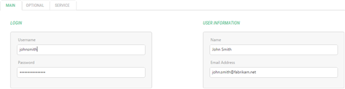
Figure 12: Customized data item editor form (Main tab)

Figure 13: Customized data item editor form (Optional tab)
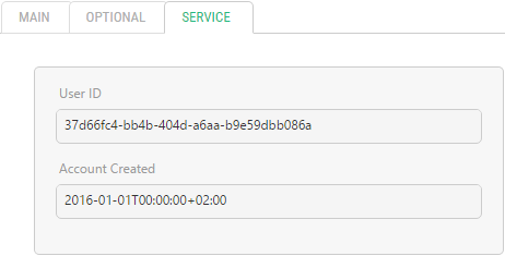
Figure 14: Customized data item editor form (Service tab)